Case Study
Verizon Mobile first
Client
Verizon
Role
UX/UI Designer
Output
300+ production-ready screens
Verizon Mobile First
Project Overview
Verizon initiated a brand refresh to modernize the customer experience across its ecosystem. The My Verizon app plays a critical role in helping customers manage plans, billing, devices, and add-ons.
However, the My Accounts and Add-Ons areas had become complex, difficult to navigate, and hard to understand. This project focused on simplifying plan management and improving clarity so customers could feel confident controlling their services.
Users struggled to:
✔ Understand their current plan and benefits
✔ Compare or modify plans easily
✔ Identify add-ons vs. available add-ons
✔ Manage multiple lines without confusion
✔ Trust pricing transparency
Business impact:
✔ Increased support calls
✔ Low add-on adoption
✔ Frictions in self-service flows
.png)
My Preference
Project Goals
-
Simplify plan & add-on management
-
Improve transparency and trust
-
Reduce cognitive load
-
Increase discoverability of features
-
Align product experience with brand refresh
My Role
-
Led Information Architecture redesign
-
Mapped end-to-end user flows
-
Facilitated Design Thinking workshops
-
Conducted moderated usability testing
-
Created scalable UI patterns
-
Designed 300+ high-fidelity screens
-
Collaborated with product, engineering, and brand teams
Key User Scenarios
-
Managing family plans
-
Comparing plan options
-
Adding premium services
-
Monitoring usage & costs
-
Switching between multiple lines
Key Pain Points
❌ Plan hierarchy unclear
❌ Add-ons felt like hidden costs
❌ Deep navigation & inconsistent labels
❌ Hard to scan & compare options
❌ Multi-line management caused confusion
Process
Journey Mapping & Flow Analysis
Mapped user journeys across personas to identify friction in plan management and add-on discovery.
Insight: Users wanted quick clarity, not deeper menus.
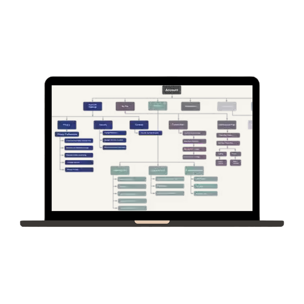
Information Architecture Redesign
Before
-
Deep layers & repeated labels
-
Mixed terminology
-
Hidden add-on discovery
After
-
Plan-first structure
-
Modular navigation
-
Consistent terminology
-
Clear entry points
New Structure
-
Overview
-
Plan Details
-
Usage
-
Add-Ons
-
Billing
-
Devices
Key User Scenarios
To align with the brand refresh, the UI emphasized clarity and hierarchy:
-
Simplified plan cards
-
Clear pricing breakdown
-
Progressive disclosure for complex details
-
Visual grouping of features
-
Sticky CTAs for key actions
Reimagining Add-Ons
Before
-
Upsell-heavy presentation
-
Benefits buried in text
-
Unclear activation status
After
-
Active vs Available clearly separated
-
Benefit-first messaging
-
Transparent pricing
-
Comparison-friendly layout
-
Line-level filtering
Outcome: Add-ons felt customizable rather than sales-driven.
Design Thinking Workshops
I facilitated cross-functional sessions to align teams early.
Activities
-
How Might We exercises
-
Assumption mapping
-
Rapid flow sketching
-
Prioritization exercises
Impact: Reduced redesign cycles and improved stakeholder alignment.
Prototyping & Usability Testing
Tested key flows including:
-
Plan switching
-
Add-on activation
-
Multi-line management
-
Cost comprehension
Key Insights
-
Users scan pricing first
-
Clear microcopy builds trust
-
Contextual cues improve line management
-
Too many icons reduce clarity
-
Iterations refined clarity and decision confidence.
Scaling & Design System Alignment
Designed for real-world complexity:
-
Multi-line states
-
Empty & error states
-
Promotional states
-
Accessibility compliance
-
Edge cases
A component-based approach enabled consistent engineering implementation.
Results
Outcomes
Simplified navigation & reduced complexity
Improved plan transparency
Increased add-on discoverability
Stronger alignment with Verizon’s new brand
.png)

Responsibilities
Key Pain Points
❌ Plan hierarchy unclear
❌ Add-ons felt like hidden costs
❌ Deep navigation & inconsistent labels
❌ Hard to scan & compare options
❌ Multi-line management caused confusion
About This Project
What This Project Demonstrates about me
UX strategy leadership
Enterprise-scale IA & system thinking
Brand-to-product experience translation
Cross-functional facilitation
Designing for complexity at scale
.png)